
Blog
How to keep up with home decor colour trends - because Beige is Back Baby!
by Dana Mooney
March 15, 2022

The interior design scene has warmed up for 2022 and beige is back in full force. So how do you transition your home into this warmer colour palette without losing your cool (grey?).

It seems like just a little while ago everyone was painting their walls a modern grey, and purchasing that "timeless" grey sofa to match. But what was once thought of as fresh and new, is suddenly becoming passé. So how do you stay on trend with the ever evolving colour palettes of interior design, without redesigning your home entirely?
1. Only do it if you want to! Trends come and go, and we've literally seen beige come and go from interiors before. But if you love the look and enjoy refreshing your home, then I have some really easy ideas for you.
2. If your walls are a mid or dark toned grey, and you just can't seem to fathom the thought of going beige, I suggest you start by just painting them a light tone of grey, closer to white. This will be easier to mix with other warm tones and feel more airy and modern than steely charcoals. Or, choose a statement wall to apply some textural monochromatic wallpaper that mixes some warm creams and cool greys together. This could be so pretty in a dining room, behind a sofa or down a hallway.
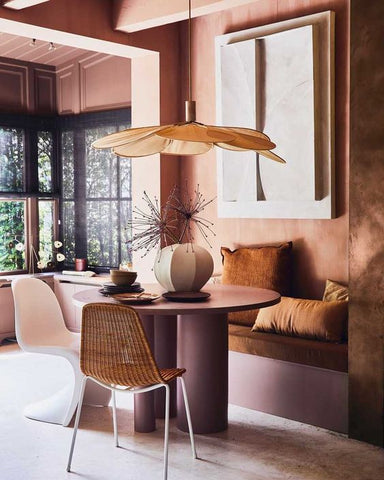
3. If terracotta and browns are just too strong for you, I suggest speckling an array of earth tones such as creams, dusty pinks, and muted greens throughout your home. These colours play more neutral in the design game, and compliment each other magically. Think larger decor items like throw blankets, dining or accent chairs, pillows and area rugs and artwork.
4. Try to inject a few pops of brighter or more saturated decor items in smaller items like vases, wall hooks, candles.
5. When thinking art, it isn't necessary to buy all new pieces if the colour palettes aren't on trend. Think of fun and new ways that you can display your art, mixing in decor to push the colour palette to something more current. Maybe you can reframe it in a way that is fresh and contemporary - think light toned wooden frames! Move the paintings to different areas of your home, try leaning them above consoles or mantles with decor layered in front. And if you purchased artwork from Dana a few years back in a different palette than your current home furnishings, reach out and see if she has any suggestions on how to incorporate new colours that work with your piece in your home decor.
0 comments